FRINGUANT Internship

How might we make it easier to find your size when online shopping?

During the summer of 2023, I worked at FRINGUANT, a startup based in Paris that creates a tool to calculate personalized size recommendations for e-commerce sites for fashion retailers.

I worked closely with the startup's Chief Product Officer (CPO) to improve the design of FRINGUANT's website and the software's user interface for several of the retail implementations.

Envisioning new website

Before my internship, FRINGUANT's website was a relatively standard website template. In talking with the co-founders, we decided on a vision for a new website design:

unique, modern, and versatile for their customers!

This meant moving away from the template-esque layout of the previous site and using a sleek, minimalist branding. FRINGUANT also had the goal of offering two landing pages, one for businesses and another for customers. The B2B end would encourage business to work with FRINGUANT to incorporate the software their retail site, while the B2C end would encourage customers to shop on the partnered retail sites with FRINGUANT integrated.

Inspiration & Wireframing

To better understand the design vision that the CPO had, I gathered website precedents and talked through what he liked/didn't like and why he felt that way. Once I had an idea of the layout and intended effect of the website, I created some wireframes as shown below.

To better understand the design vision that the CPO had, I gathered website precedents and talked through what he liked/didn't like and why he felt that way. Once I had an idea of the layout and intended effect of the website, I created some wireframes as shown below.

To better understand the design vision that the CPO had, I gathered website precedents and talked through what he liked/didn't like and why he felt that way. Once I had an idea of the layout and intended effect of the website, I created some wireframes as shown below.

Iterating & More Iterating

For each screen of the website, I created countless iterations, making small changes to layout, color, padding, shadow, etc. This ensured I got useful feedback from the CPO.

For each screen of the website, I created countless iterations, making small changes to layout, color, padding, shadow, etc. This ensured I got useful feedback from the CPO.

For each screen of the website, I created countless iterations, making small changes to layout, color, padding, shadow, etc. This ensured I got useful feedback from the CPO.

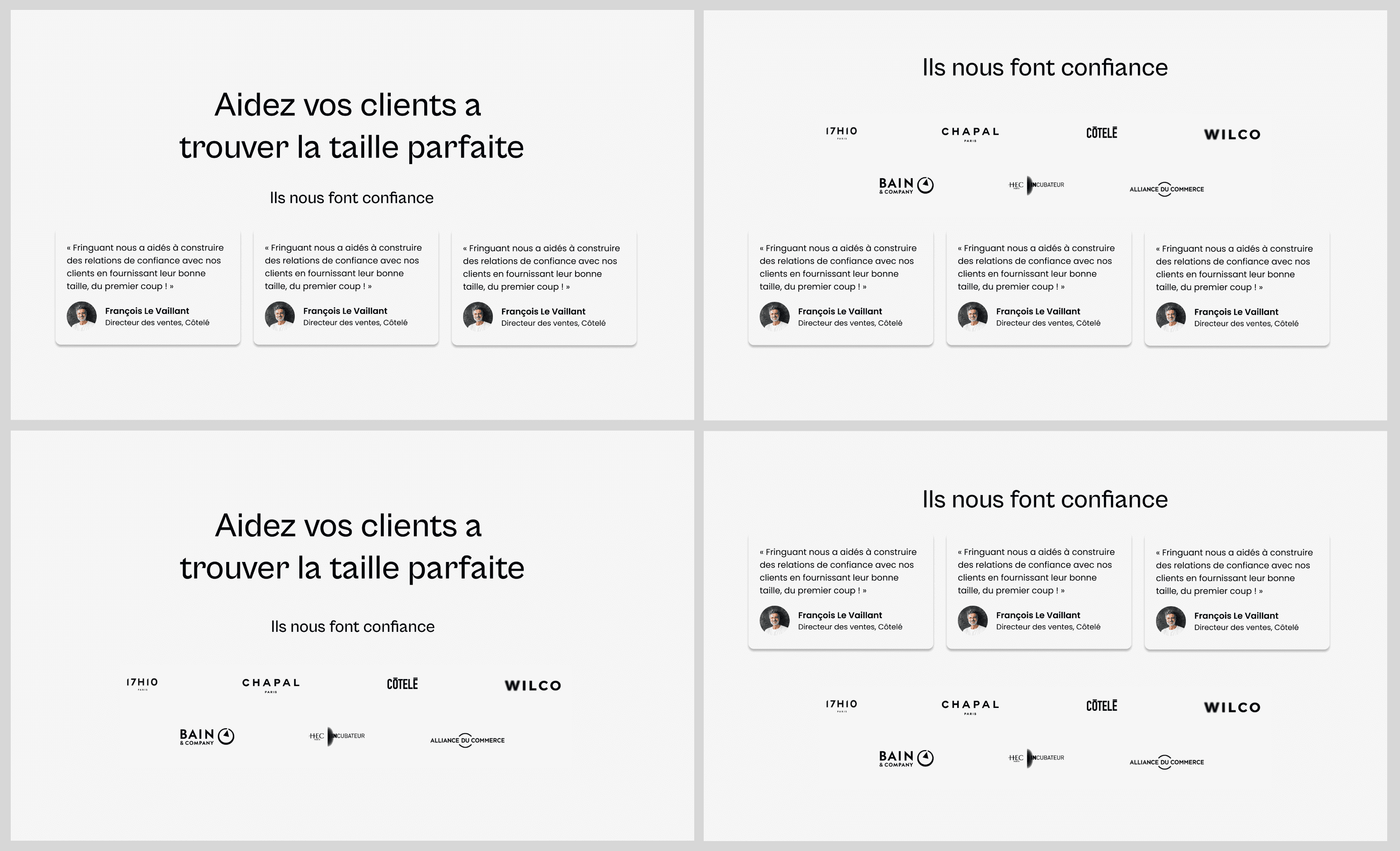
These were a few of the early iterations for the endorsements page.

Improving the User Interface

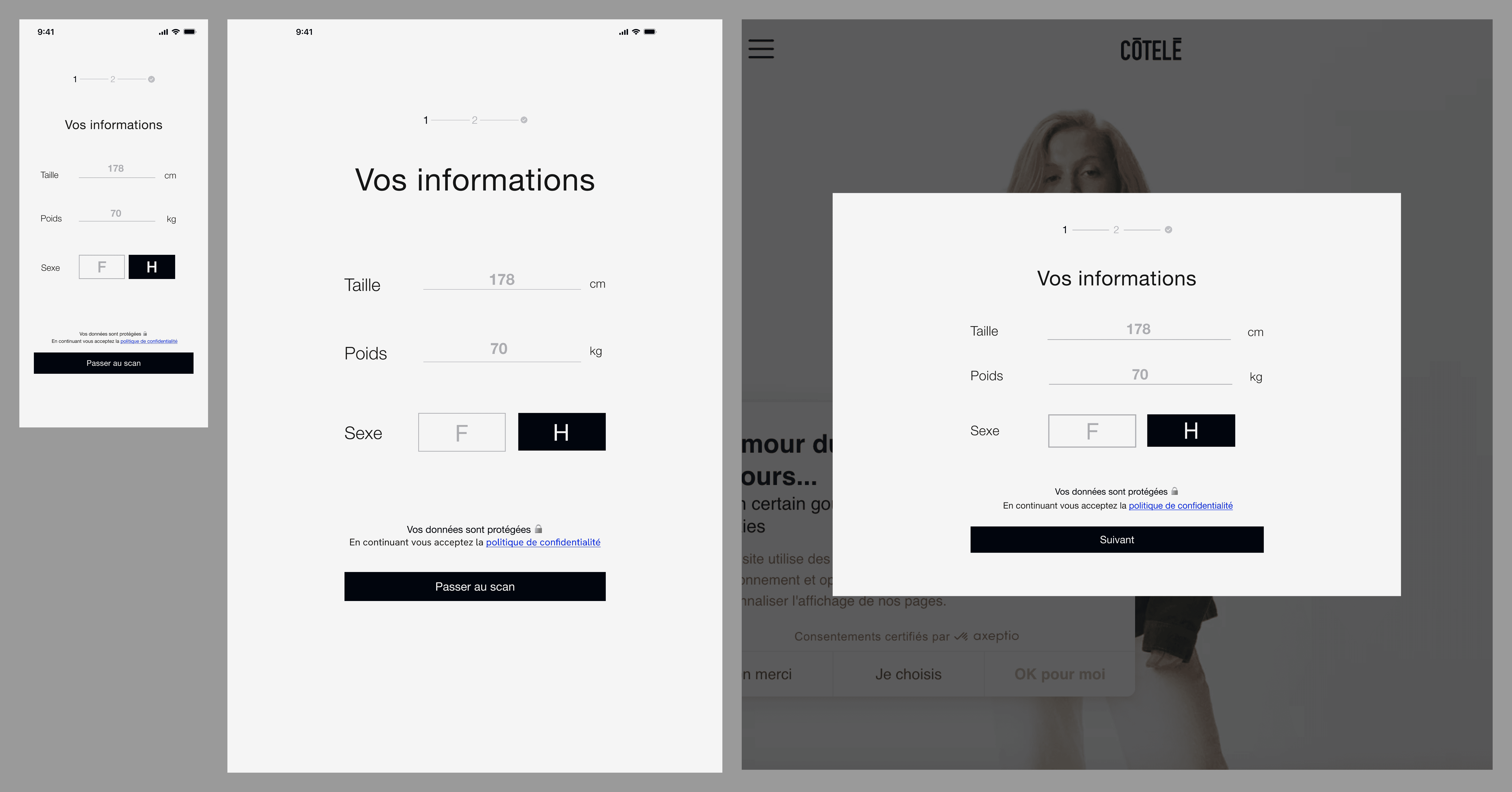
Along with redesigning the website, I worked closely with the CPO and software engineers to improve the user interface of the FRINGUANT software. I worked on iterating different screens, improving the design system, and ensuring designs were ready to deploy. Some more of the aspects of the design I worked on included:

  • Creating responsive designs for six different breakpoints

    • Creating desktop designs based on mobile designs

  • Creating components (buttons, icons, etc) for each screen

  • Exploring typography choices

Final design

Here was my final design of the B2B website, followed by the B2C website.

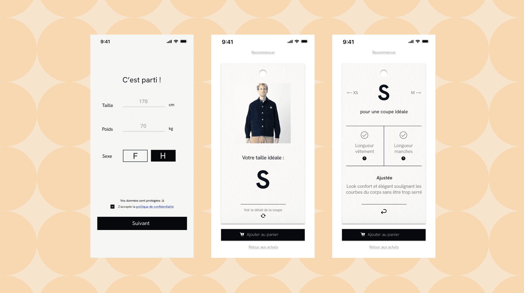
Here was my final design of the user interface flow from end to end.

Takeaways

Designing in this startup environment taught me about the design cycle and the importance of iteration. Working closely with a CPO with a very refined design taste helped me develop my intuition when it comes to visual design. I also worked closely with the engineers deploying my designs, which taught me best practices when creating designs that will be launched. Overall, this experience was great practice for working on the design of real-world product with a real team and real customers.
let's get connected!

let's get connected!

let's get connected!