Simply Cambridge
How might we make finding affordable housing in Cambridge more accessible?
This was a two-month final project for my design class, where were asked to identify a problem and design some form of technology to address it.
Finding affordable Cambridge housing is an incredibly complicated and bureaucratic process, with a waitlist of over 20,000 residents hoping for a unit. With the presence of Harvard, MIT, and many biotechnology companies, affordable housing units are limited, thus the process of applying is crucial for those in need.
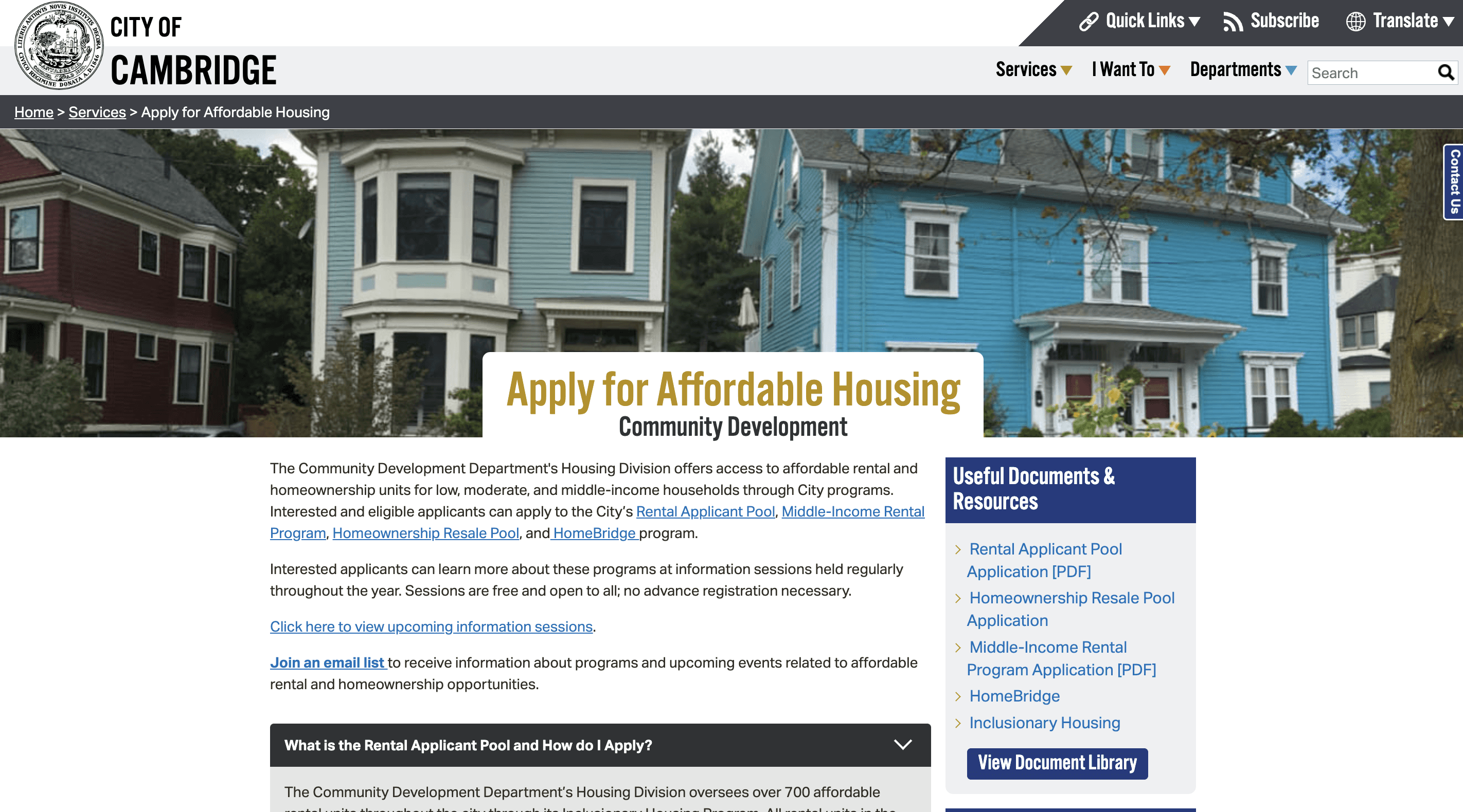
Currently, information about applying to affordable housing is scattered across many pages making it hard to clearly understand the process.
What is wrong with the process?
Knowledge about certain listings is not widely available and finding information about affordable housing can be difficult.
No consolidated platform has updated information on both public and private properties with affordable units.
Regulations around housing are set by the City of Cambridge, which can be unexpected by tenants.
The core issue that emerged from research was a lack of transparency in the available listings and the affordable housing process.
How do we proceed as designers?
As this is a complex social issue, I aimed to create a solution that reduces inequality through transparency in the housing process.
This means addressing the information gap for low-income or price-conscious residents by centralizing accessible data.
How do we fix it?
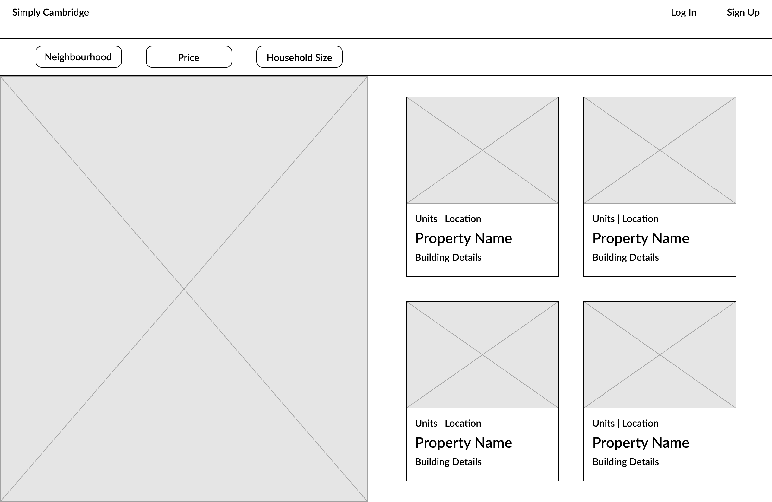
With our problem and mission in mind, I came up with different ideas for what a solution could look like, experimenting with the way we displayed information to the user. To help decide on a direction, I showed 4 wireframes to potential users.
I experimented with different ways of displaying the information, including an iteration of the site that matches families to units.
Deciding on a direction
Based on our conversations with users, they liked …
having all available listings be shown in one place, so the matching algorithm was not appealing to most.
being able to filter listings, and users were most interested in filtering by household size and price rather than neighborhood.
being aware of regulations set by the City of Cambridge when looking at a listing, i.e. if a unit doesn't allow pets.
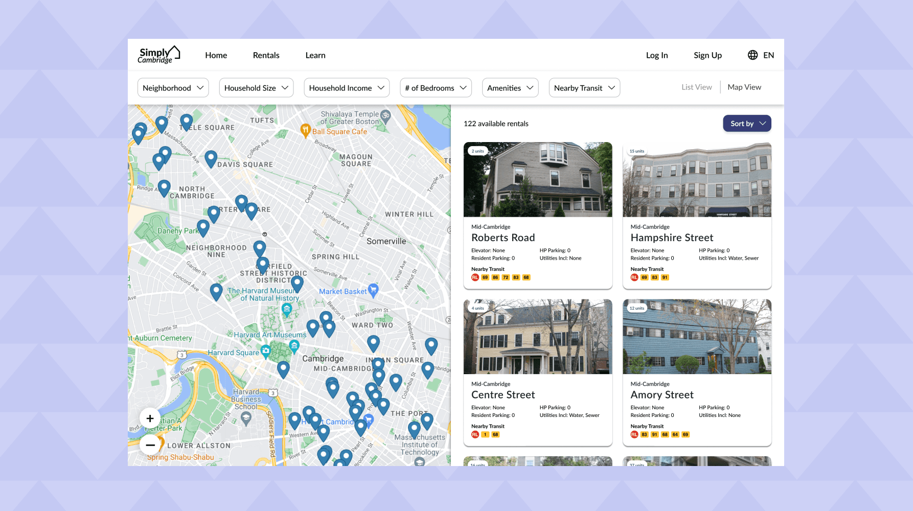
Based on feedback, I decided to go with the following layout as it was most effective in displaying all listings clearly and followed a familiar layout. I noted for the final design that filters and comprehensive descriptions for the listings were important to users.
I went for this layout with an option to switch to a list layout, allowing for compact viewing and seeing the map!
Getting more feedback
In the process of design iterations, I got some more feedback and added features accordingly.
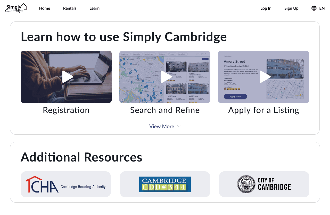
To make sure the site was accessible, especially for those less comfortable with technology, I had to ensure it was easy to learn how to use the website, so I added a Learn page with tutorial videos.
Many of the tenants who use our site may not be fluent in English, so it was crucial to make the Change Language button clear and effective.
Final design
This was my final design for the Simply Cambridge housing portal, showing the main pages displaying the rentals, the Home page, and the Learn page.
Next steps & takeaways
This project was more than a fixing a design problem — it was a deep dive into a significant social issue. I learnt about the importance of understanding the context that I was designing in, especially when dealing with the policies and government structures of finding affordable housing.
Though this was a class project, it became clear that improving this process required not just better design but also meaningful collaboration with government bodies and policymakers. This work we’ve done so far is only one piece of a much larger puzzle to improving the transparency of the housing process.


